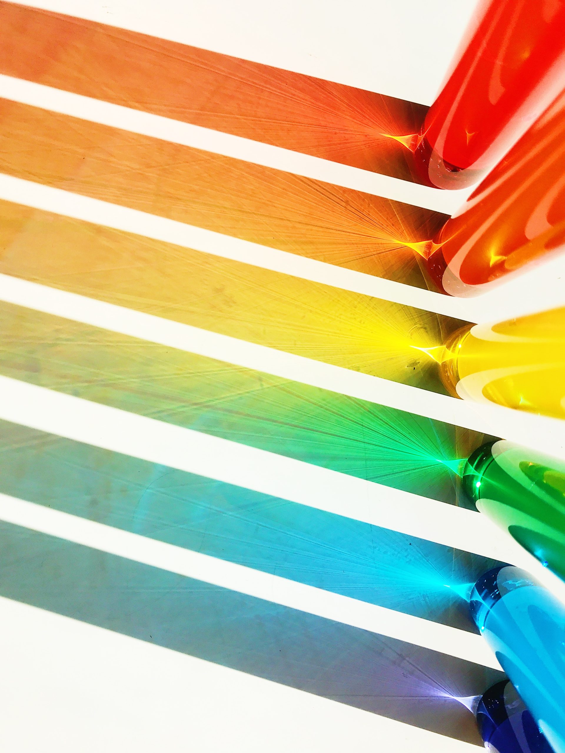
The right choice of logo colors for your brand is essential for making a strong and lasting impression. The colors you choose can influence how people perceive and interact with your business, as well as how they remember it. It’s important to consider the psychological implications of color when selecting a logo design. Different hues can evoke different emotions and send powerful messages that define the look, feel, and mission of your brand.
Contents
Logo Colors
When it comes to choosing the right colors for your logo, it’s important to keep in mind what message you want to convey. Different colors evoke different emotions and attitudes, so it’s crucial to pick a color scheme that aligns with your brand values and personality. For example, blue is often associated with trustworthiness and professionalism, while green conveys growth and freshness.
Another aspect to consider when choosing your logo colors is how they will look across various platforms and mediums. Make sure that the colors are easy on the eyes and reproduce well in both print and digital formats. It’s also worth noting that certain color combinations may not be legible for people who are colorblind, so test out different options before making a final decision.
Ultimately, your logo should reflect who you are as a brand while also resonating with your target audience. Keep these factors in mind when selecting your logo colors – they can make all the difference in creating a lasting impression on customers.

Color Psychology
Choosing the right colors for your logo is crucial as it can impact how consumers perceive your brand. Color psychology plays a significant role in the way people view and react to different hues, tones, and shades. For example, blue is often associated with trustworthiness and stability, making it an excellent choice for brands that want to convey reliability and professionalism. On the other hand, orange is often associated with excitement and enthusiasm, making it a great option for brands that want to appear energetic or playful.
It’s important to consider not only what emotions you want your brand to evoke but also what colors will stand out in your industry. If you’re creating a logo for a healthcare company, blues and greens may be more appropriate than reds or yellows because they convey feelings of calmness and cleanliness. Additionally, it’s essential to keep cultural differences in mind when choosing colors as some hues have different meanings in various parts of the world.
Ultimately, there’s no one-size-fits-all answer when it comes to selecting the best color scheme for your logo; however, by considering factors such as color psychology and cultural significance, you can create a design that resonates with your target audience while accurately representing your brand’s values.

Color Trends
When it comes to logo design, choosing the right colors is crucial for your brand’s identity. Color trends are constantly evolving and it’s important to stay updated on what works best in today’s market. One popular color trend is minimalism, with many brands opting for simple and clean designs that feature only one or two colors. This approach can help to create a strong and memorable visual identity for your brand.
Another important factor when considering logo colors is the emotional response they elicit from consumers. For example, blue is often associated with trust, while red can convey passion and energy. It’s important to choose colors that align with your brand’s values and messaging, as this will ultimately help to build trust with your target audience.
Ultimately, choosing the right colors for your logo requires careful consideration of both current trends and the emotional responses they elicit from consumers. By keeping these factors in mind, you can create a strong visual identity that accurately represents your brand and resonates with potential customers.

Choosing Your Brand Colors
When it comes to branding, choosing the right colors for your logo is essential. Your brand colors can have a significant impact on how your audience perceives your company and its values. Therefore, it’s crucial to choose colors that align with the message you want to convey.
When selecting brand colors, consider the emotions that certain hues evoke. For instance, blue is often associated with trust and dependability, while green symbolizes growth and nature. On the other hand, red is known for its energy and passion. By understanding color psychology, you can select hues that resonate with your target audience.
Finally, don’t forget to consider color combinations when designing your logo. The right combination of complementary or contrasting colors can create a powerful visual impact and make your brand more memorable. However, be sure not to use too many colors in one design as it could appear cluttered or confusing. Ultimately, choosing the perfect brand color palette requires careful consideration of both aesthetics and meaning to create a lasting impression on customers.

Color Combinations
Color combinations play a crucial role in creating an unforgettable brand. A well-designed logo can instantly communicate your company’s values, personality and style to potential customers. When choosing colors for your logo, it is important to consider the psychology behind each color and how they will be perceived by your audience. For example, blue is often associated with trustworthiness, while red conveys energy and excitement.
Another factor to keep in mind when selecting colors for your logo is the context in which it will be used. Will it primarily be displayed on digital platforms or printed materials? The color scheme you choose should be versatile enough to look great across all mediums. Additionally, you want to ensure that your logo stands out from competitors within your industry while still being visually appealing.
In conclusion, choosing the right color combination for your brand’s logo requires careful consideration of both psychological factors and practical considerations like versatility and competition. By taking the time to develop a strong visual identity through design elements like color, you can create a lasting impression with potential customers that sets you apart from others in your industry.

Accessibility and Legibility
When it comes to logo design, accessibility and legibility should be at the forefront of your decision-making process. Your logo will serve as a representation of your business or brand and will appear on various mediums. From digital platforms to print materials, it is essential that your logo is easily recognizable and readable.
One way to ensure accessibility and legibility in your logo design is by selecting colors that contrast well with one another. Dark text on a light background or vice versa can enhance legibility. Additionally, taking into consideration color blindness can further improve accessibility for all viewers.
It’s also important to keep in mind the size at which your logo will be displayed. A complicated or intricate design may not translate well when scaled down for smaller applications like social media profile pictures or business cards. Choosing a simple yet effective design can ensure that your logo remains legible at any size, while still making an impactful statement for your brand identity.

Conclusion
In conclusion, choosing the right color for your logo is crucial in building a strong brand identity. It’s important to consider the psychology behind colors and what emotions they evoke in consumers. Blue, for example, is often associated with trust and reliability, making it a popular choice for financial institutions. Red, on the other hand, can create a sense of urgency or excitement and is often used by fast-food chains.
Additionally, it’s important to consider how your logo will look across different mediums and backgrounds. A bright green logo may stand out on a white background but could be difficult to read on a dark background. Make sure to test your logo in various settings before finalizing the design.
Lastly, don’t be afraid to seek professional help when designing your logo. Working with a graphic designer or branding agency can ensure that you create a visually appealing and effective logo that accurately represents your brand values and message.


