
Column charts are used to compare values across categories. They are similar to bar charts and bar graphs, but the bars in a column chart are displayed as vertical rectangles, with the values for each category listed on the left side of the chart. Column charts often show how a variable changes over time or compare deals between two different types. They can also show how a company’s stock price has changed over time.
Column charts differ from pie charts, bar graphs, and other graphs in displaying visual data. When you employ this chart type, it’s helpful to know when a column chart is most useful and when to provide the best visual representation of a data series. Here’s what you need to know.
What are the benefits of column charts?
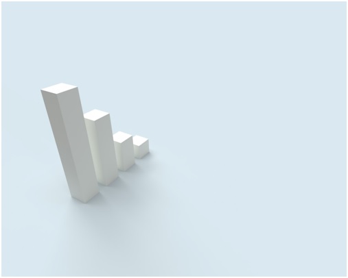
What are the benefits of column charts? Column charts are a great way to compare data points side by side. They can be used to compare data between two or more categories. Column charts are also great for data sorted in ascending or descending order. This type of chart is beneficial when you want to see how one data point compares to the others.
There are many reasons why charts are essential in a business setting. Perhaps the most obvious reason is that they help to visualize data. When data is conveyed in a graph, it is easier for people to understand and analyze. This is especially important when trying to decide what course of action to take regarding the data.
Another reason why charts are essential is that they can help to simplify complex data. By presenting data in a graph, it can be broken down into more manageable pieces. This can be especially helpful when trying to understand information technology data over a long period of time or when there are a lot of different data points.
Finally, charts can help communicate data to others. When data is presented in a graph, it is easier for others to understand than if it is just written out in the text. This can be especially helpful when trying to make a case to management or present data to a group of people.
How should you use charts in your business?

Not all charts are created equal. However, when creating charts for your business, there are a few things to keep in mind. Here are a few tips:
- Use the correct type of chart. There are many different types of charts, and each one is best suited for a specific purpose. For example, bar charts are good for comparing data points, while line charts track trends over time.
- Make sure your big data is accurate. This may seem like a no-brainer, but it’s essential to ensure your information is correct before creating charts. Otherwise, your charts will be inaccurate and misleading.
- Use visuals to your advantage. Charts can be helpful for understanding data, but they can be even more effective when paired with visuals. For example, adding graphs and images can help improve understanding and make data more memorable.
- Keep your charts simple. Simplicity is vital when it comes to effective charts. Too much information can be confusing and distracting. Instead, focus on the most critical data points and keep your charts concise and easy to understand.
- Test your charts before presenting them. It’s always good to test your charts before presenting them to decision-makers. This will help you make sure they’re accurate and easy to understand.
Charts are an essential part of business, and following these tips will help you create effective charts that provide valuable information to your team.


