
Building a brand as a wedding planner or event stylist is about more than just business cards and referrals—it’s about creating an unforgettable first impression. And what better way to do that than with a logo that speaks elegance, creativity, and trust? A well-designed logo instantly tells potential clients who you are and what you represent.
TLDR: Crafting a logo for a wedding planner or event stylist should reflect sophistication, style, and professionalism. This article offers twelve carefully curated logo ideas tailored for professionals in the wedding and event industry. Whether you want something minimal, floral, or bold, there’s a concept here for every kind of stylist. From calligraphy to geometric designs, these ideas will help elevate your brand identity.
Contents
1. Elegant Script Monogram
One of the most timeless styles for wedding planners is the elegant script monogram. This logo idea plays around with your initials in an ornate, often calligraphy-style script. Think flowing lines, delicate flourishes, and soft curves to evoke romance and sophistication. Perfect for high-end boutique planners who want a classic look.
2. Floral Emblem
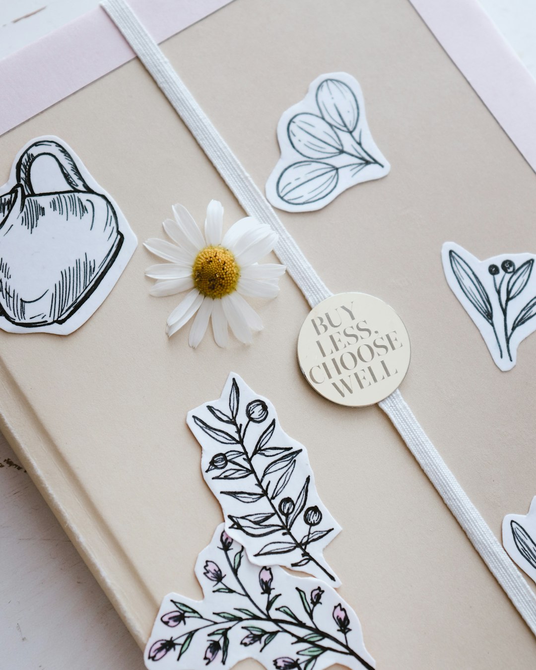
A floral emblem combines the universal beauty of flowers with simple design elements. You might see a logo where roses, peonies, or eucalyptus stems weave around your business name or initials in a circular format. This style is ideal for planners featuring rustic, bohemian, or outdoor event themes.
3. Minimalist Gold Foil Typography
If your brand screams modern luxury, consider a minimalist logo with clean typography and subtle gold foil accents. Even in digital formats, this effect can be emulated through shading and color, providing a high-end finish without complexity. Pair a sleek sans-serif font with wide spacing to communicate calm confidence.
4. Geometric Framework
For modern wedding planners who focus on contemporary themes, a geometric logo design works beautifully. Triangles, hexagons, and abstract shapes can frame your name or emblem. Use symmetry and angular precision to signify professionalism and attention to detail.
5. Watercolor Crest
Inspired by European family crests and artistic backgrounds, a watercolor crest features soft colors and brush strokes arranged into an emblem. Common elements include doves, rings, initials, or venue illustrations. It’s ideal for planners who incorporate fine art or vintage aesthetics into their services.
6. Vintage Stamp Style
A logo that looks like a traditional stamp or seal is perfect for those who want to evoke a sense of heritage, reliability, and trust. This style often includes serif fonts, bordered circles, and classic illustrations such as olive branches or champagne glasses. It’s both charmingly retro and stylishly timeless.
7. Signature Brush Style
Make your logo feel personal and hands-on with a signature brush stroke look. Simulate the feel of handwritten notes using textured strokes and ink effects. This logo works well for stylists who maintain a close, intimate relationship with clients and want to convey warmth and personal attention.
8. Botanical Line Art
Clean, single-line illustrations of leaves, flowers, or vines combined with simple serif or script fonts strike a balance between natural elegance and contemporary style. This approach is highly versatile and works well across digital platforms, print media, and signage.
9. Art Deco Glam
Evocative of the roaring ’20s, an art deco design features geometric motifs, metallic colors, and symmetry. Think precise lines, diamond shapes, and gold-on-black color schemes. Perfect for stylists and planners who love glamour with a vintage twist.
10. Whimsical Hand-drawn Elements
Include playful illustrations like lanterns, arches, or dancing couples to give your logo a light-hearted, joyful character. When hand-drawn and paired with a soft color palette, these elements make the logo feel imaginative and full of promise.
11. Modern Serif Typography
Use a custom or high-end serif font to present your name front and center. Opt for a stacked name layout or solitary uppercase initials that look clean yet luxurious. Missing the frills doesn’t mean missing personality—this style is all about chic simplicity and gravitas.
12. Celestial Motifs
Incorporate stars, moons, or astrological symbols to add a dreamy or mystical aura to your branding. These logos feel ethereal and imaginative, perfect for stylists who lean into fantasy, nighttime events, or romantic fairytale themes.
Why a Logo Matters in the Wedding & Event Industry
Your logo is your visual handshake—it’s seen before your services are experienced. A strong logo builds brand recognition, engenders trust, and conveys professionalism from the first glance. For creative professionals like wedding planners and event stylists, the logo also gives a clue into the artistic direction you might bring to their event.
Key Things to Keep in Mind When Designing Your Logo:
- Scalability: Make sure your logo looks good on everything from business cards to large banners.
- Readability: Even ornate designs should clearly communicate your name or initials.
- Timelessness: Avoid oversaturated trends to ensure your logo stays relevant for years.
- Color Scheme: Choose colors that reflect your brand’s personality—soft pastels for romance, bold golds for luxury, neutrals for versatility.
In an industry that thrives on aesthetics, having a thoughtfully designed logo is crucial. Whether minimalist or ornate, your logo should immediately mirror the style and tone of the events you plan. Invest the time in crafting one that truly speaks to your vision.
FAQs About Logo Design for Wedding Planners and Event Stylists
Q: Should I hire a graphic designer or use online tools?
A: While platforms like Canva and Looka can help you create basic logos, hiring a professional designer ensures your logo is unique, well-balanced, and future-proof. For branding longevity, a custom design is well worth the investment.
Q: What file formats should I request from my designer?
A: Always ask for vector files like AI, EPS, or SVG for scalability, plus PNG and JPG for general use. Having both horizontal and vertical lockups can also provide flexibility across platforms.
Q: Can I use photography or real images in my logo?
A: It’s best to avoid using real photos in logos. Stick to illustrations, icons, or stylized vector graphics. Logos should be easily reproducible and recognizable even with scaling or color changes.
Q: How many colors should I use in my logo?
A: Typically, 2–3 colors is ideal. Too many colors can make your logo look cluttered. Use contrasting tones for elements you want to stand out and stay consistent with your overall brand palette.
Q: Is it necessary to include my full business name?
A: Not necessarily. Many logos feature just initials or a single word when the full name is too long. However, including the full name can be helpful when you’re just starting and building recognition.
Choosing or designing a logo is a creative journey that reflects your mission and aesthetic sensibilities. Whether it’s a delicate monogram or a bold geometric shape, ensuring your logo aligns with your brand identity is essential to building a strong presence in the event industry.

