
When building a website with WordPress, there’s a lot to think about — design, functionality, responsiveness, and of course, branding. One of the most important elements of branding is your logo. Knowing where and how to place your logo across desktop and mobile views can make or break the user experience. Whether you’re a designer, developer, or business owner using a website builder like Elementor, Divi, or Beaver Builder, strategic logo placement is key to making a lasting impression.
TLDR: Proper logo placement in WordPress builders is essential for brand visibility and UX design. The header is the most conventional and high-traffic spot for logos, but don’t overlook the footer or mobile variations. Builders provide flexible options, but you need to think about how designs adapt across screen sizes. This guide helps you make informed layout choices across header, footer, and mobile placements.
Contents
Why Logo Placement Matters
Your site’s logo isn’t just decorative — it’s a visual stamp of your identity. It’s often the first thing a visitor notices and acts as a navigation anchor, typically linking back to the homepage. A poorly placed or resized logo can confuse users, reduce brand impact, and compromise accessibility.
Here are a few reasons why thoughtful logo placement is essential:
- First impressions: Your logo conveys professionalism and branding from the initial moment a user visits your site.
- Navigation aid: Logos typically link back to the homepage, giving users an intuitive way to restart their journey.
- Trust element: A consistent logo placement enhances trust and improves brand recall.
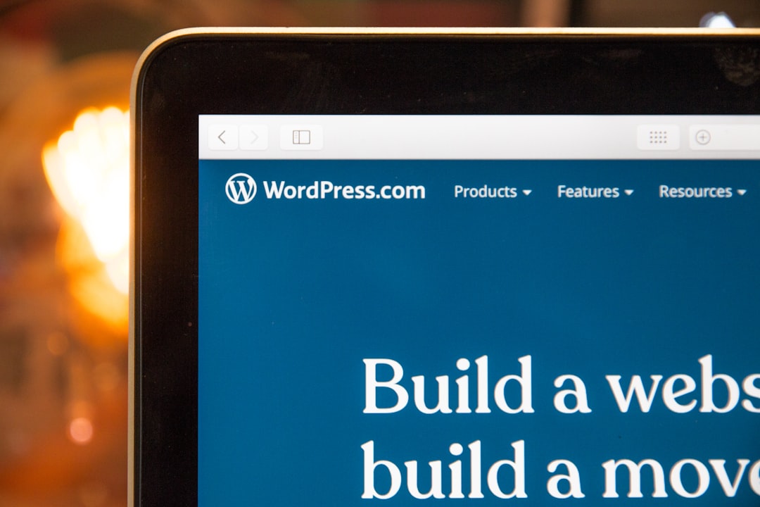
Logo Placement in the Header
The header is the most common and expected location for a website logo. Positioning your logo in the header ensures that it is instantaneously visible — making it both aesthetically pleasing and functionally reliable.
Most WordPress builders like Elementor, Divi, and WPBakery offer intuitive drag-and-drop options that allow you to place your logo on the left, center, or right part of the header. Each layout has strategic benefits:
- Left-aligned: Most intuitive and commonly used. Aligns with Western reading patterns and is regarded as a web design standard.
- Center-aligned: Ideal for symmetrical layouts or minimal designs. Works well with navigation menus that split around the logo.
- Right-aligned: Rare usage but can create a unique branding experience when done tastefully. Best for unconventional layouts.
Tips:
- Use a transparent PNG or SVG for retina display compatibility.
- Keep the logo size between 100px – 250px in width for desktop browsers.
- Ensure there’s adequate padding so the logo doesn’t feel cramped.
While less prominent than the header, the footer is another strategic location for logo placement — especially on long content-heavy pages. Including the logo here reinforces branding at the end of a user’s journey and provides visual closure.
When you design footers in WordPress builders, you can use columns, widgets, or flex containers to aesthetically include your logo, usually at the bottom left or center. While not a replacement for header-based logos, footer logos serve complementary branding purposes.
Benefits of footer logo placement include:
- Consistent brand presence throughout the page.
- Improved UX by offering another home-navigation option at the page’s end.
- Better visual balance for lengthy or content-dense pages.
Best practices:
- Use a monochromatic or simplified version of your primary logo to preserve design coherence.
- Ensure the logo contrasts well with dark background footers.
- Keep its size smaller than the header logo — typically 60px to 120px in width.
Responsive Logo Design for Mobile
With over 50% of web traffic coming from mobile devices, having a responsive logo is non-negotiable. Mobile screens require condensed menus, streamlined visuals, and touch-friendly layouts — meaning your logo must scale appropriately without losing clarity or impact.
Key considerations when placing a logo for mobile devices:
- Size and scaling: Your logo should be vector-based or high-resolution to stay sharp on retina displays. Opt for SVGs or responsive JPGs/PNGs.
- Burger menu alignment: Usually, the logo is placed left of the hamburger icon. Make sure there is enough space to avoid crowding the top bar.
- Simplification: Consider using an icon or simplified graphic for mobile screens, especially if your standard logo is complex or text-heavy.
Responsive design tools in WordPress builders:
- Elementor: Offers breakpoints and visibility settings where you can display different logos per device type.
- Divi: Use built-in responsive editing to change logo sizes or replace images for desktop, tablet, and mobile views.
- Beaver Builder: Customize header templates specifically for mobile through theme settings or add-ons.
Common Logo Placement Mistakes to Avoid
When it comes to logo positioning, some missteps can derail your site’s usability and aesthetic impact. Below are a few common pitfalls and how to avoid them:
- Overly large logos: An oversized logo can dominate your layout and push important elements down the page. Stick to recommended size guidelines.
- Ignoring responsiveness: A logo that looks good on desktop might appear squashed on smaller screens. Always preview your site across devices.
- Mismatched branding: Using different logo styles across header, footer, and mobile layouts can confuse users. Maintain stylistic consistency.
- Broken links: Always ensure clicking the logo redirects to the homepage — it’s a UX expectation.
Using Logo Widgets & Theme Builders
Most modern WordPress builders come with built-in logo widgets and dynamic content fields. These tools allow your logo to adapt flexibly across templates without needing custom code — perfect for users who want to maintain uniform branding with less effort.
Features to look for:
- Drag-and-drop support for repositioning your logo.
- Dynamic tag support — automatically include the site logo across global templates.
- Custom class and ID settings for custom styling using CSS.
Some popular third-party plugins also enhance logo placement flexibility, such as:
- Header Footer Elementor – build custom headers & footers that adapt per page or device.
- Sticky Menu (or Anything!) on Scroll – keep your logo visible as users scroll down.
- Logo Carousel – display multiple logos if partnering with different brands or organizations.
Conclusion
Strategic logo placement in WordPress builders goes beyond mere aesthetics — it plays a vital role in branding, usability, and responsiveness. From clear positioning in the header to functional repetition in the footer, and essential adaptation for mobile, your logo needs to be thoughtfully placed to resonate with users on every device.
By leveraging the capabilities within builders like Elementor, Divi, and others, you can ensure that your logo acts as a consistent, responsive, and effective branding tool across your entire site. Avoid common mistakes, stay aware of screen behaviors, and make logo placement a core component of your web design strategy.


